Before + After – Kitchen Renovation
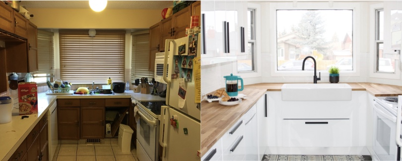
One of my very favorite things about my job is that, in order to do it well, I have to really get to know my clients. I love learning about people. When I first met with this homeowner, she was unsure about what she wanted, what styles she liked, and what to expect. She was sure, though, that her kitchen desperately needed to be updated. Cabinet doors were literally falling off, and the microwave had been installed too close to the stove, causing it to melt. Eek!
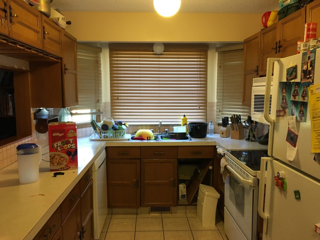
We talked quite a bit about what was working for her such as the basic layout, and the fact that she liked having tile floors, and what wasn’t, like the cat dish that was constantly in the way and getting kicked, and the super low microwave.
I suggested that we close in the pass-through opening to modernize the space and create more cabinet space and, to my delight, she was on board. I also recommended that we install ceiling-height upper cabinets. I think between those two choices, we at least doubled the available storage space in the upper cabinets. That’s a big deal in a small space!
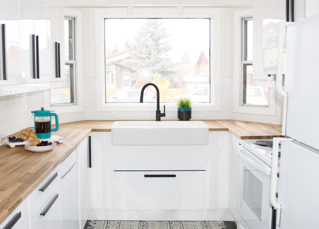
To begin, she was quite sure that she did NOT want a white kitchen. She felt that white would feel too sterile and uninteresting and wouldn’t suit her. Since she was quite unsure about what style she preferred and direction she wanted to go in, I asked a lot of questions, reviewed the design style quiz I send out to all my new clients and sent her a curated list of inspiration photos with a huge range of color and style options to look through.
Funnily enough, her favorite (by far) was a bright white kitchen with butcher block countertops. We discussed the pros of butcher block (great price, the lovely worn in look they get over time, the way they warm up a white kitchen) and the cons (not heat resistant, have to be conditioned regularly) and she she was keen to move forward with the plan.
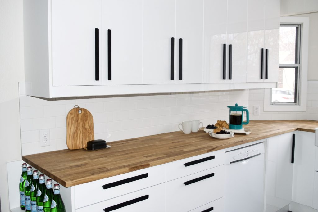
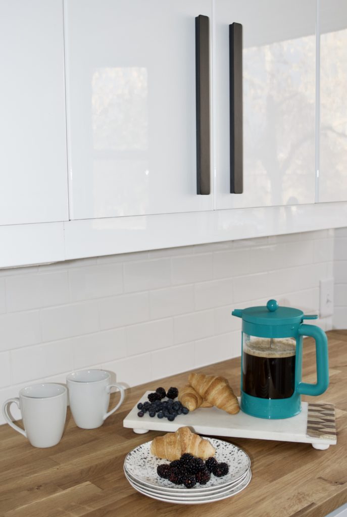
The plan had always been to renovate the kitchen on a budget, which made IKEA cabinets the obvious choice. The white, flat front door options at IKEA are quite limited, and while IKEA has just added a white shake style door, it wasn’t an option at the time. She did not like the integrated handles of the Voxtorp, and both the Veddinge and Haggeby doors get consistently mediocre reviews. The Rimghult doors, however, seem to get rave reviews on durability compared to other IKEA options. She was a little nervous that a high gloss finish would look far too modern for her preferences, so I turned to Pinterest for some photos of high gloss cabinets with butcher block counters. Once she could see how they would work together, we agreed that it was the best available option.
When selecting the cabinet pulls, I knew she would be happiest with something that created interest and impact, after hearing that she felt the doors with integrated handles would bee too boring. We looked at quite a few options from several stores, but both of us liked the oversized Hackas handles from IKEA best. They were a great price, and between the large size and contrast they make a bold visual impact.
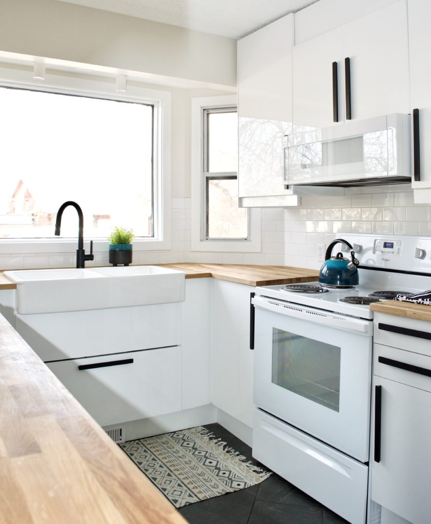
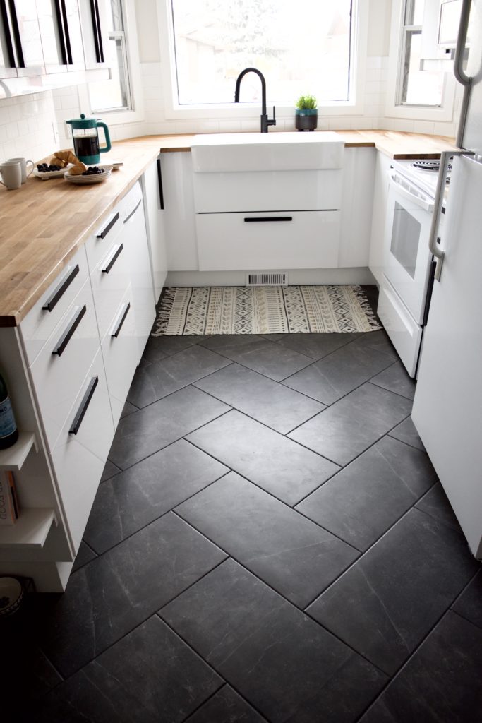
Classic white subway tile is both thrifty and timeless, and was an easy pick. For the floor, we chose a dark grey ceramic tile, laid in a herringbone pattern. She really loved the look of dark, charcoal grey floors, but I was concerned about how much all the dust, and kid-crumbs, and cat hair would show on such dark tile. I chose a tile that had the depth of color she liked, that also had some veining, and variation in color throughout, to help camouflage the debris that comes with kids and pets.
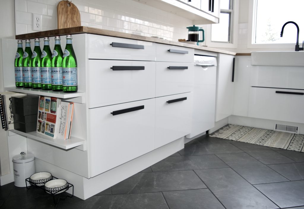
Two of the issues that were causing them frustration in the old kitchen were the location of the cat dish, and not having an easy waste-sorting solution. We left the cat dishes at the end of the long bank of cabinets, where they originally were; improving the situation with a larger gap between the doorway and the end of the cabinets, and an open shelf above the dishes to help direct traffic away from that spot. Now the cat dishes tuck neatly under the shelf, and don’t interfere with the traffic flow through the kitchen. For the waste sorting, IKEA had quite a few good options. We agreed that under the sink was the easiest place, and selected a cabinet with a drawer meant for waste sorting. We also changed out some of the lower cabinets for large drawers to give them easier access to posts and pans etc.
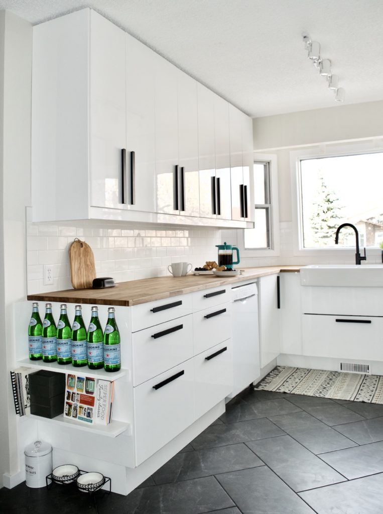
In the bay window, there was an awkward semi-flush light fixture that looked quite out of place with a structural beam in front of it. I selected very simple, modern track lighting so it would “disappear” behind the beam and look tidy and open. We also installed the same track lighting in the center of the kitchen. Using the same light in both places, and leaving the ceiling white and open works to create a spacious feeling in a tight space. That, along with the contrast of the dark floors with the white ceiling build on that open feeling. Focused on keeping things light and bright, we painted the walls in Benjamin Moore’s Classic Gray.
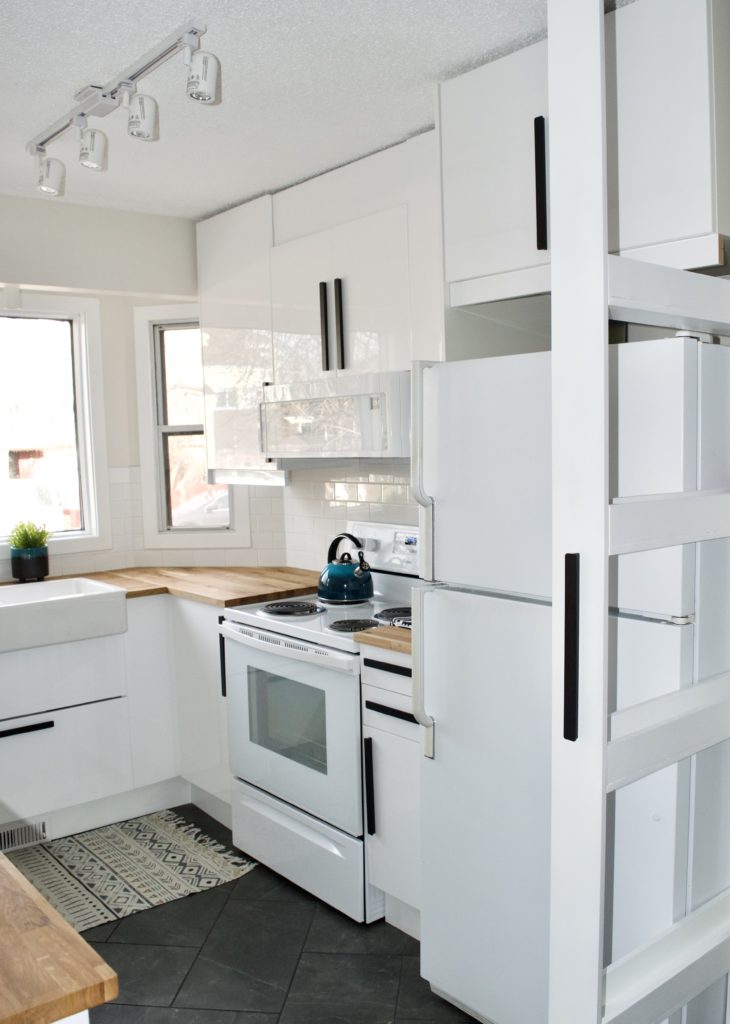
Lastly, we added a super narrow, roll-out pantry beside the fridge to create more storage in what would otherwise be wasted space. When we were discussing what they had in their cabinets, and how we could be most space efficient and thoughtful in our design, they said that they could use more space for spices. They have every spice under the sun, and buy in bulk-that’s a lot of spice storage! I also noticed they had lots of cereal for the kids, and measured the boxes to ensure the little pantry could accommodate them, along with spices, canned goods, and other small items. To save money, and allow for easy removal if they decided to replace their fridge with something larger in the future, we opted for a roll-out version mounted on heavy duty casters, rather than a slide-out option on built-in tracks.
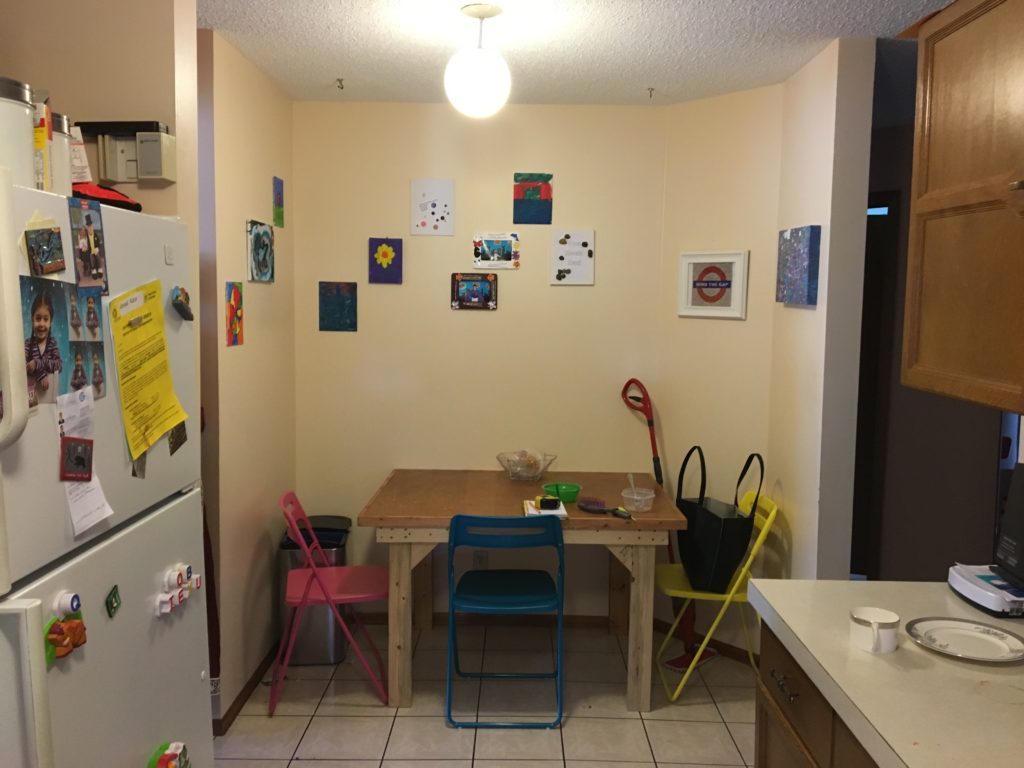
The kitchen had a very small, awkward dining nook that was quite tricky to use well, mainly due to an asymmetrical footprint with an angled wall in one corner. I considered our options for expanding the kitchen, or rearranging things to make better use of the space, but there were no options that would work without a huge, whole house remodel.
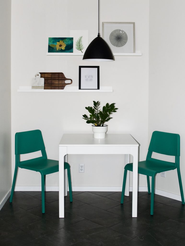
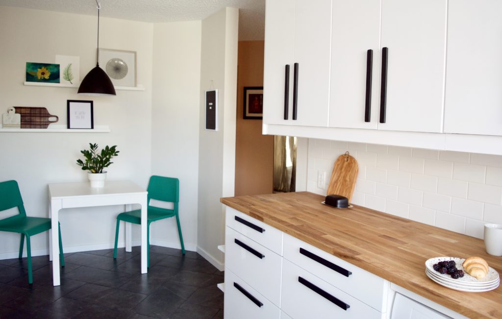
oAfter lots of playing with options, we purchased a small, extendable dining table that will allow them to create more seating when entertaining, without crowding the space on a day-to-day basis. Using a smaller table really opened up this area! The emerald green chairs add a fun pop of color that can easily be changed out for something else in 5 or 10 years if they tire of the color.
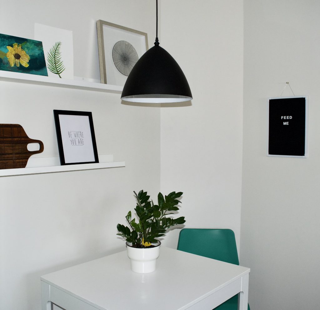
When I first saw the kitchen I immediately noticed all of the children’s’ beautiful artwork on the wall. Not wanting to displace their lovely work, I suggested photo ledges to display them in a tidy, curated manner. Now they can change out their art themselves as they bring new pieces home to share with their family.
Working with this family was such a pleasure, and I just love the transformation. Shout out to Urban Village Contracting for all their hard work on this project!
