Fresh Start – Modern Scandinavian Condo
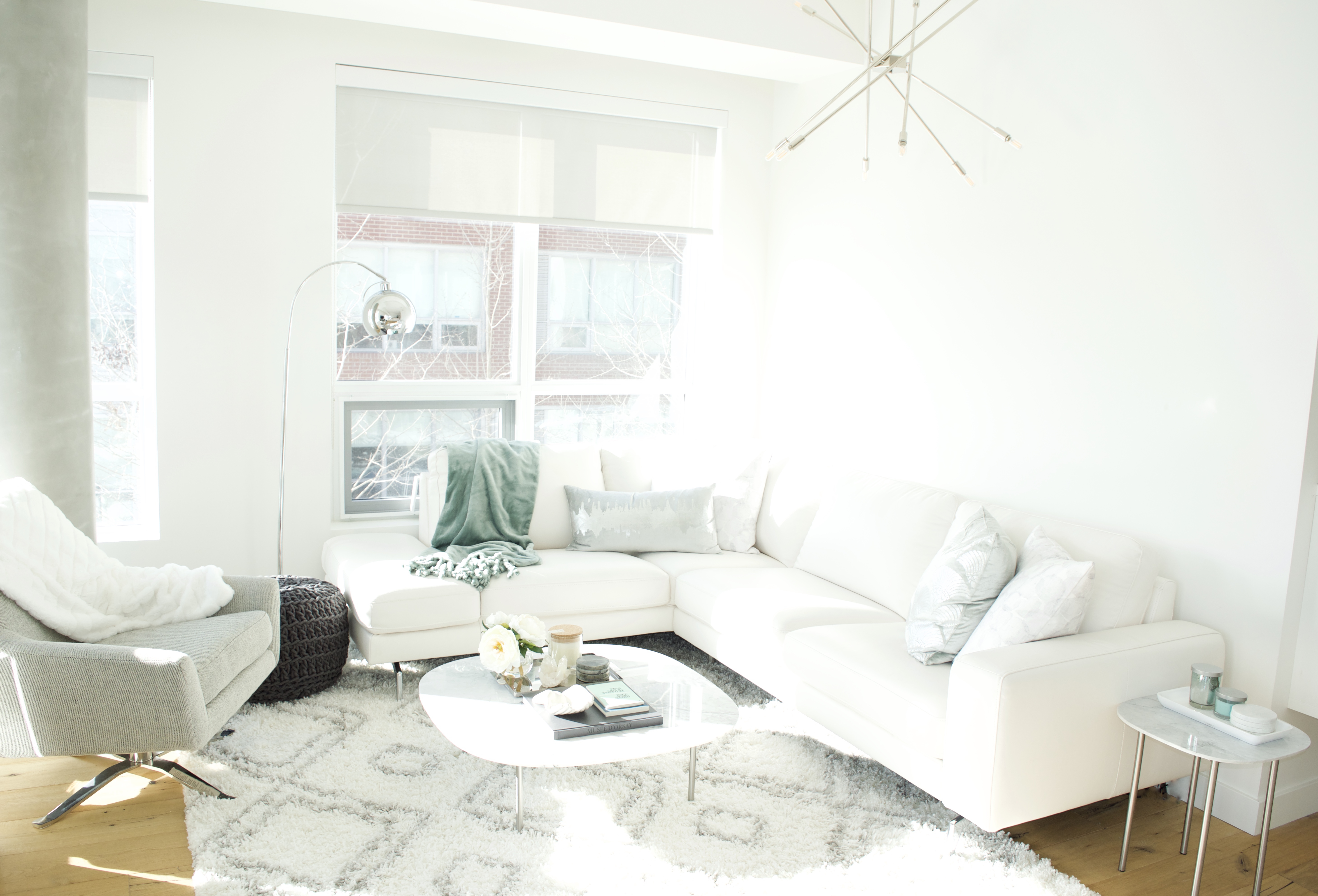
When I first met S & B (not of Gossip Girl fame…) late in 2018, they were just about to take possession of a new Inglewood apartment. I instantly loved them. They are the warmest, chattiest mother-daughter duo with such a close, wonderful relationship. There was quite a mix of emotion in the process of selling and buying, as they are grieving the loss of their husband and father. This apartment was a fresh start, especially for mama B, who said she wants to start focusing on enjoying and living life fully, even as she carries the loss and grief with her.
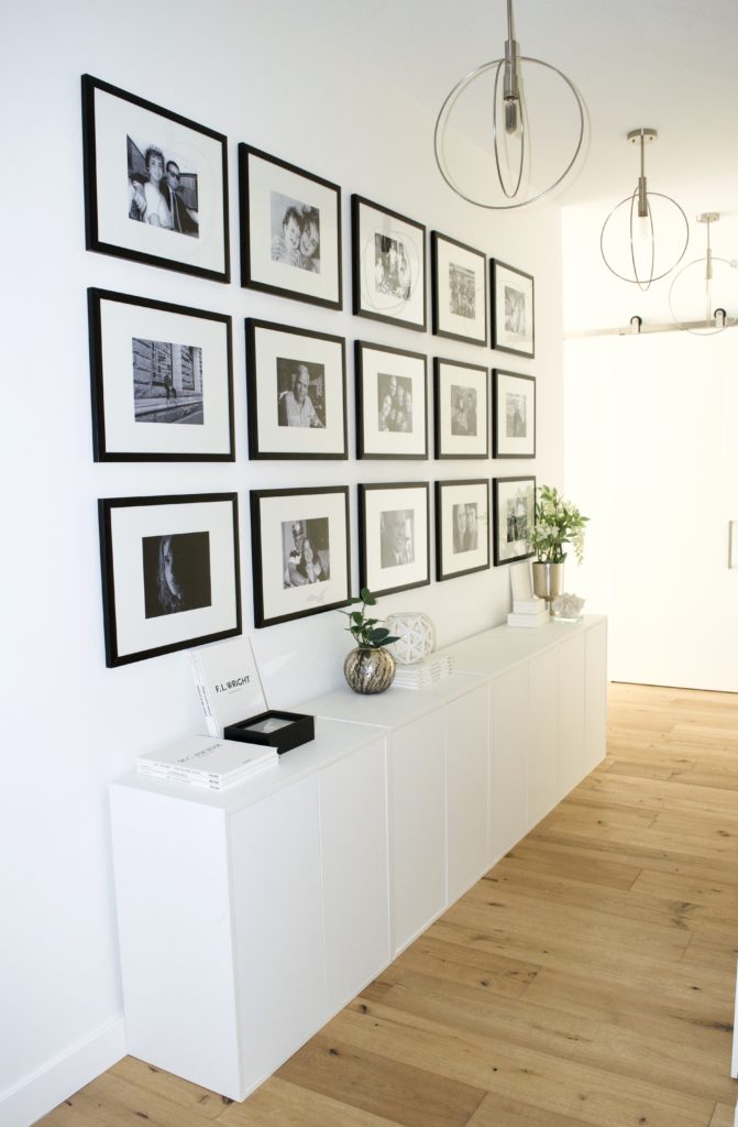
Upon first walking into the apartment, there is a small entrance with a closet and a long hallway with 9-foot ceilings. As we talked more, I learned they also had their hearts set on a wall full of family photos but they couldn’t imagine how it could work in a modern, uncluttered way. A bank of IKEA Eket cabinets nearly the length of the hallway, provides much-needed storage for papers, keepsakes, and other items they wanted handy but tucked away. I suggested printing photos in black and white, and hanging them in a grid to fit with their aesthetic, and to keep things looking tidy and well curated.
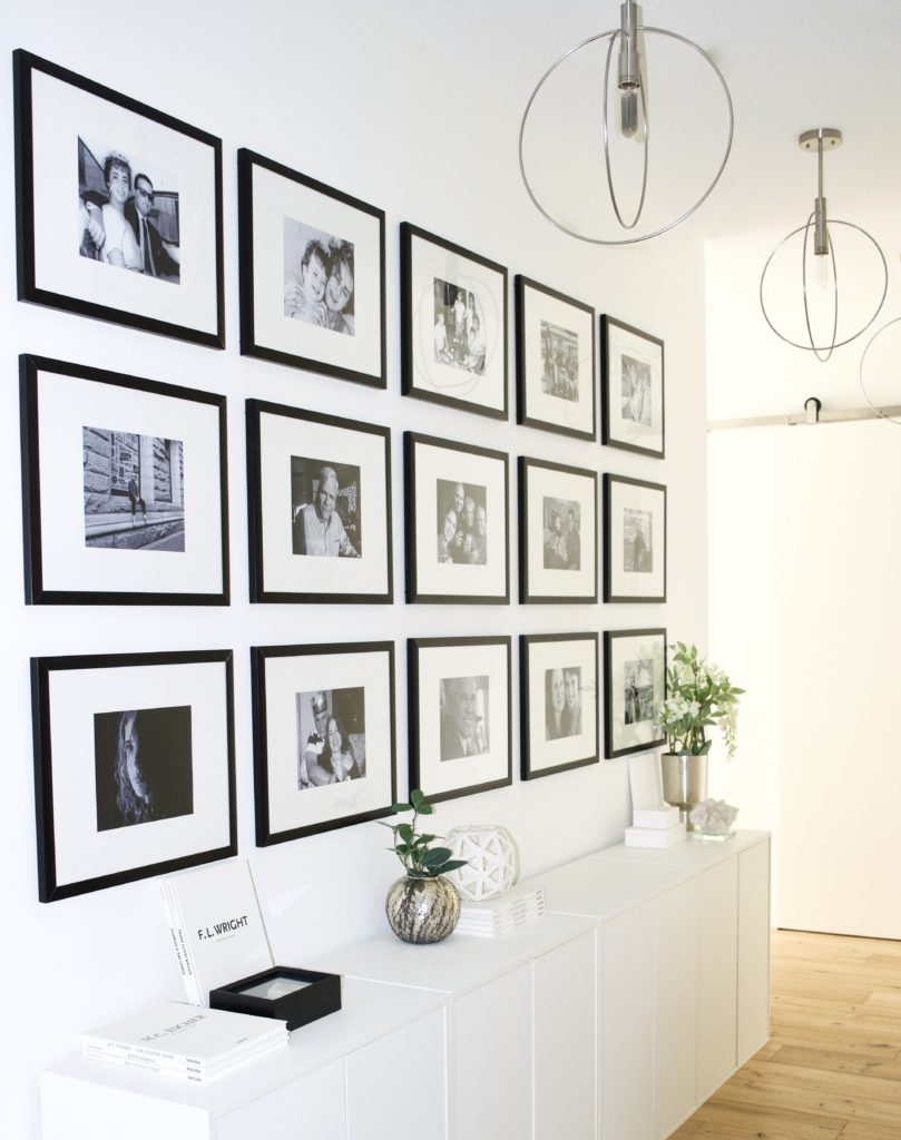
We replaced the builder-grade spotlights with brushed nickel orb pendants that we luckily found on clearance. Minimal styling on the cabinets keeps things uncluttered and keeps the focus on the gallery wall. When she saw the books, S remarked that she had been eyeing up this exact Taschen art series – serendipity!
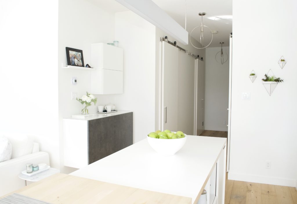
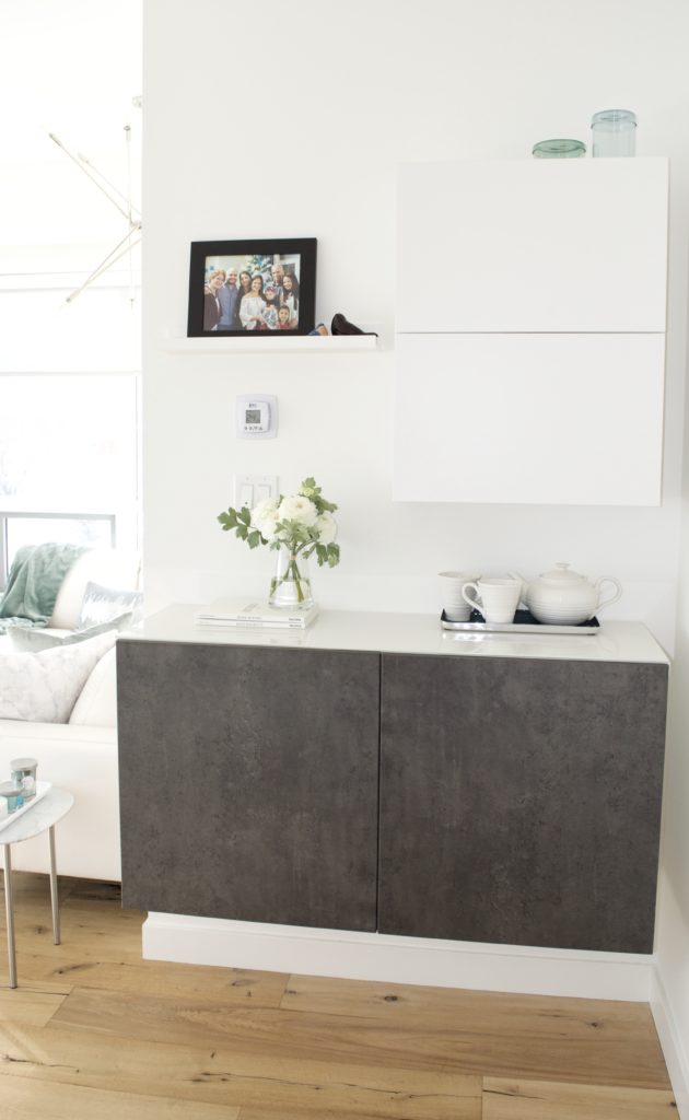
Down the hall and around the corner is an open concept living/dining/kitchen area with a little nook next to the kitchen. In order to maximize storage and keep things feeling light, we opted for floating Besta cabinets. The asymmetrical design allowed us to add some extra closed storage without having to relocate the thermostat or light switches. The deeper, dark grey bottom cabinet grounds the space and breaks up the sea of white, and the picture ledge creates balance despite the asymmetry. This is a handy little flex space- it holds mail and office supplies, as well as extra dishes. The bottom unit is topped with glass for durability and can be used as extra service space on special occasions as needed.
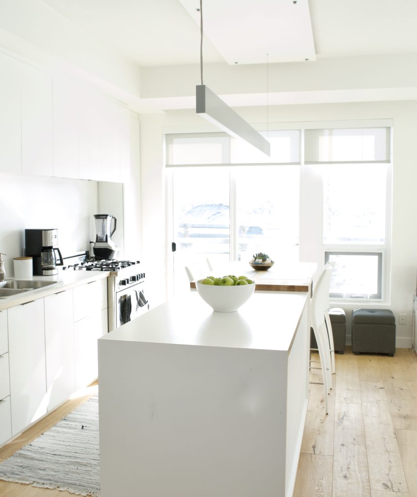
The galley style kitchen had far less storage space than they were used to, and they were having a hard time figuring out how to fit everything in, even after purging several times. I suggested adding a pantry cabinet in the empty space between the oven and window. After looking at the available options, we opted for an IKEA Pax wardrobe for two reasons: its size (one of the few options that was available in our tall, narrow, and not too deep measurement range) and the ability to easily customize the interior.
On the bottom, we left the shelf open for heavy items such as flour and sugar, then installed three drawers within an easy to see range for smaller and packaged items and shelves the rest of the way up. We added trim to top of the cabinet right, up to the ceiling to create a built-in look at a fraction of the cost.
High back white leather counter stools at the eating bar offer comfort with a minimal visual impact to help keep the kitchen looking tidy. Between the wall and island, a low traffic spot, we stashed some extra ottomans under the window for additional flexible seating when they’re entertaining.
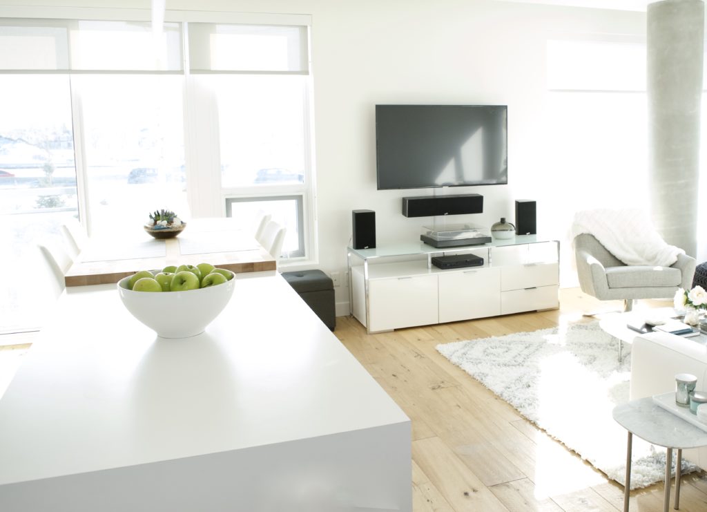
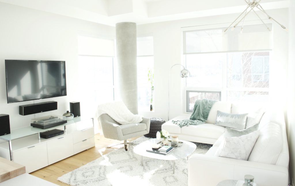
In the living room, the TV and speakers were mounted on the wall, and the TV stand offers a place for a much loved turntable to rest. Early on, I learned from S that mama B loves to have a relaxing coffee and look out the window each morning. That presented a bit of a challenge for the layout of the space with the large column in the best corner of the room! We had already flipped the original layout to make room for a sectional (the TV was previously on the opposite wall) and I suggested a gorgeous swivel chair from West Elm to offer flexibility in the room. Now, when mama wants to have a leisurely coffee, she just spins the chair around, and can enjoy the view easily. The rest of the time it faces inward, creating a cozy conversation area.
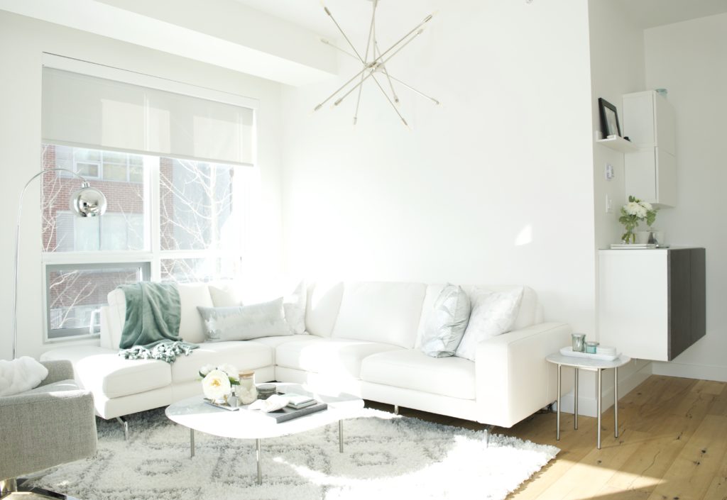
The aesthetic goal for the space was minimal, cozy, bright and open, but each of them mentioned several times that they wanted the main area to be really special, and great for entertaining. By layering in metallic finishes and luxe textures, we were able to create a balance between the minimalist glam and cozy Scandi styles they seemed to be leaning toward. The builder-grade track lighting was swapped out for a modern sputnik-style chandelier and a shiny chrome arc lamp adds more control over the lighting levels. The arc lamp also serves to break up the white walls and windows without making things busy. The silver accents are repeated throughout the apartment in the throw pillows, furniture legs, lighting and accessories to really lift the space.
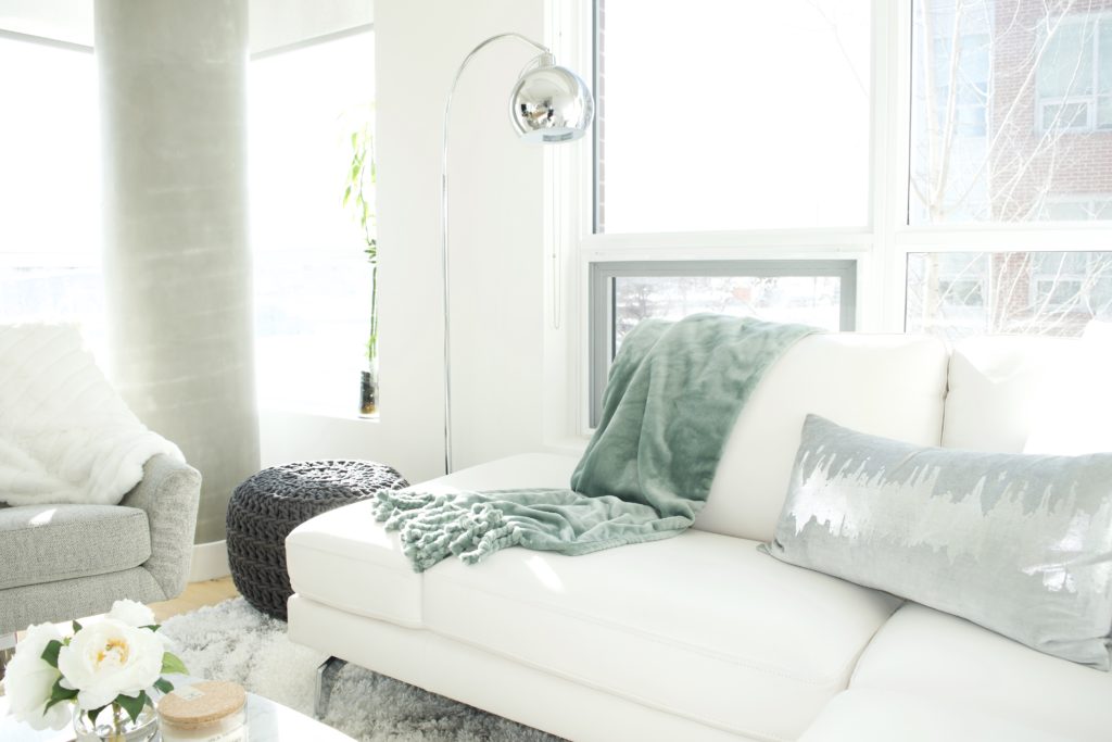
Finding the right floor plan and sectional for the small living room was a challenge. We briefly considered an IKEA option with lots of storage space, but no one was really excited about it. They wanted white but were apprehensive about staining a new sofa. I knew white leather was the right option for them, but knew it would be difficult to find a budget-friendly option…until I found this gorgeous sectional, on clearance at Structube.
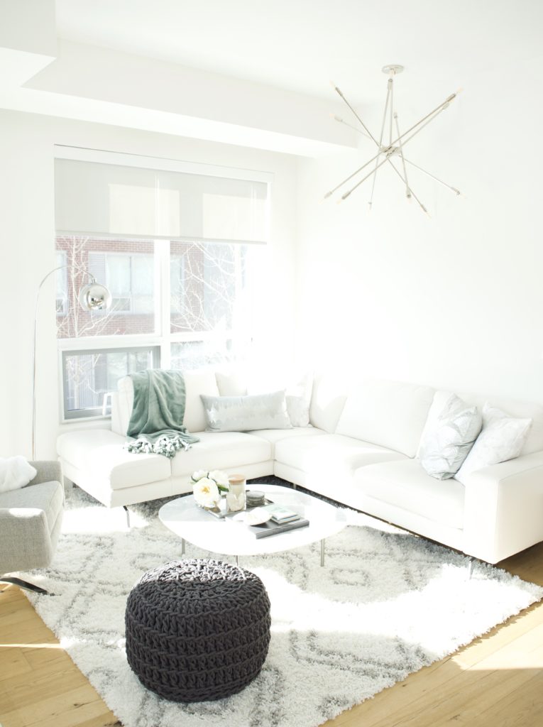
To create a cozy feeling for this very warm little family in such a minimal, modern space, I relied on thoughtfully mixed textiles. A two-toned shag rug, knit pouf, velvet pillows, a plush fringed throw blanket, leather sectional and twill chair create subtle layers of texture and pattern that warm the space up. Natural elements such as the wood plank floors, plants and flowers and marble tables further adds to the layered effect without overwhelming the room.
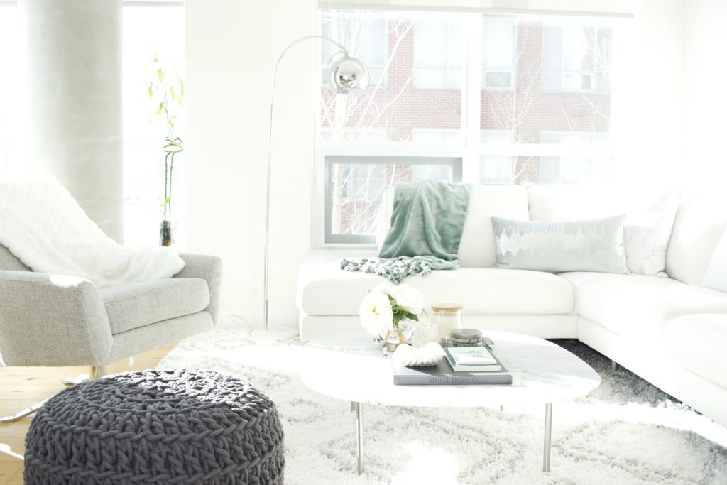
Mama B kept mentioning that she wanted colour in the space, but nearly every inspiration photo they picked was monochromatic and neutral. To balance those competing desires, I chose accessories in soft shades of seafoam green, and they’ve commissioned a piece of art from a local artist for the wall behind the couch in colours that will work well with the decor.
I am so, so honoured to have been a part of creating this fresh start for this wonderful pair. Wishing you more light than dark as you move forward, S & B.
yesterday – i was the moon
today- just an eclipse
something in me travels; some days it’s to
the dark
some days it’s to
the light
-Noor Unnahar


