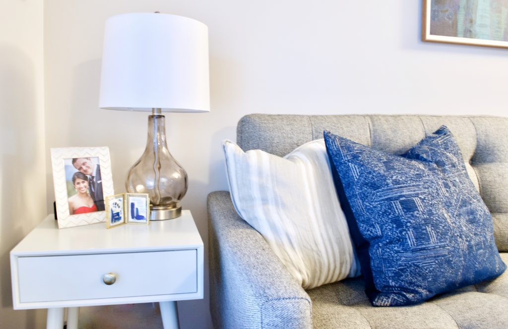
Living Room Makeover: Family-Friendly Function Meets Grown-Up Style
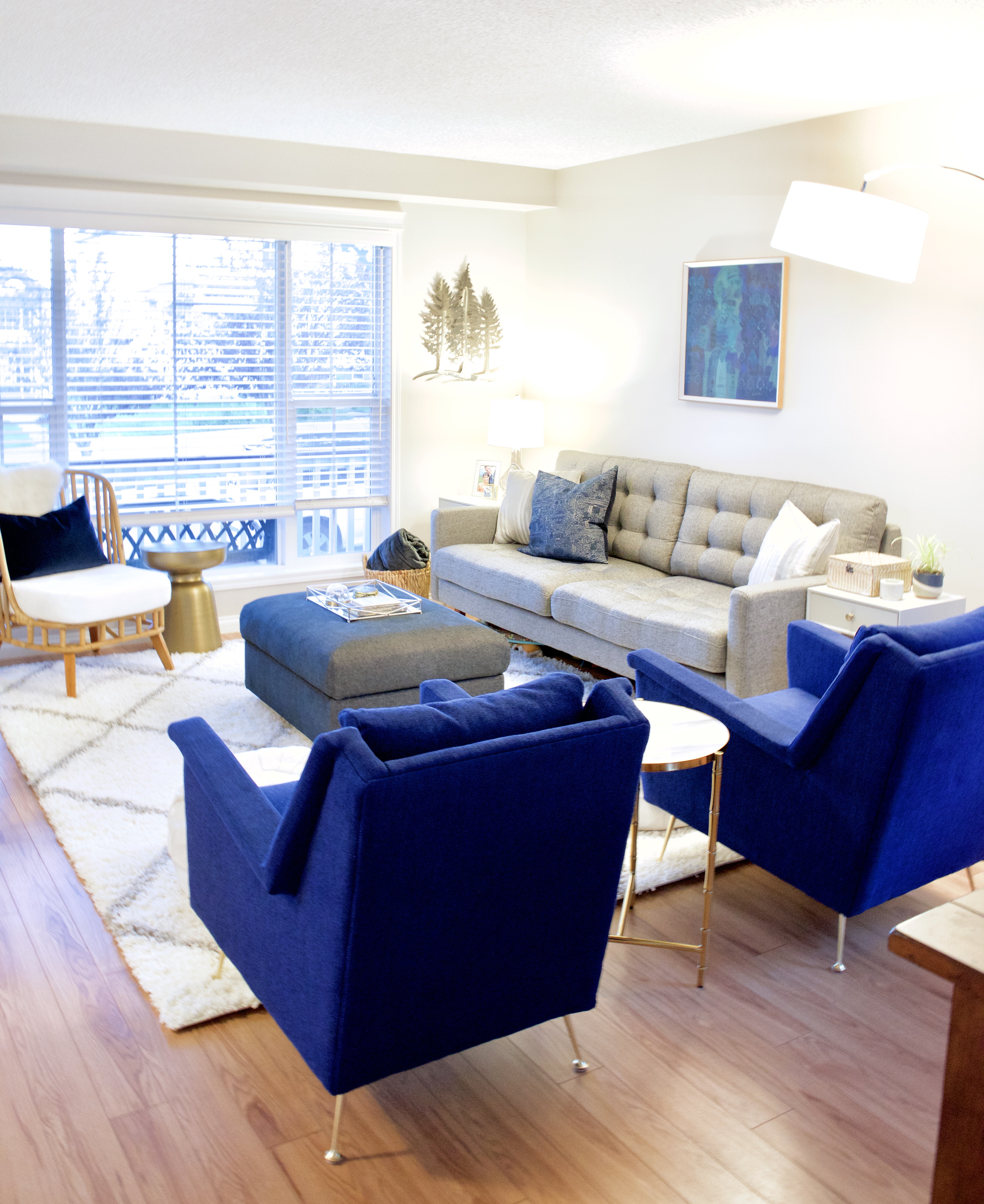
When I first met V&P, a lovely young couple, it was clear how much they genuinely adore and enjoy each other and their sweet little toddler. While their home was certainly cozy, they had never really decorated their home before. They did however, have an art collection that they had been slowly building as they travelled and found pieces they really loved (you can see the trees and blue/green abstract in the photos, but there is so much more). They were unsure about the process, but were willing to take a leap of faith with me, and assured me they trusted me to create something they would love. What a gift to be given so much trust!
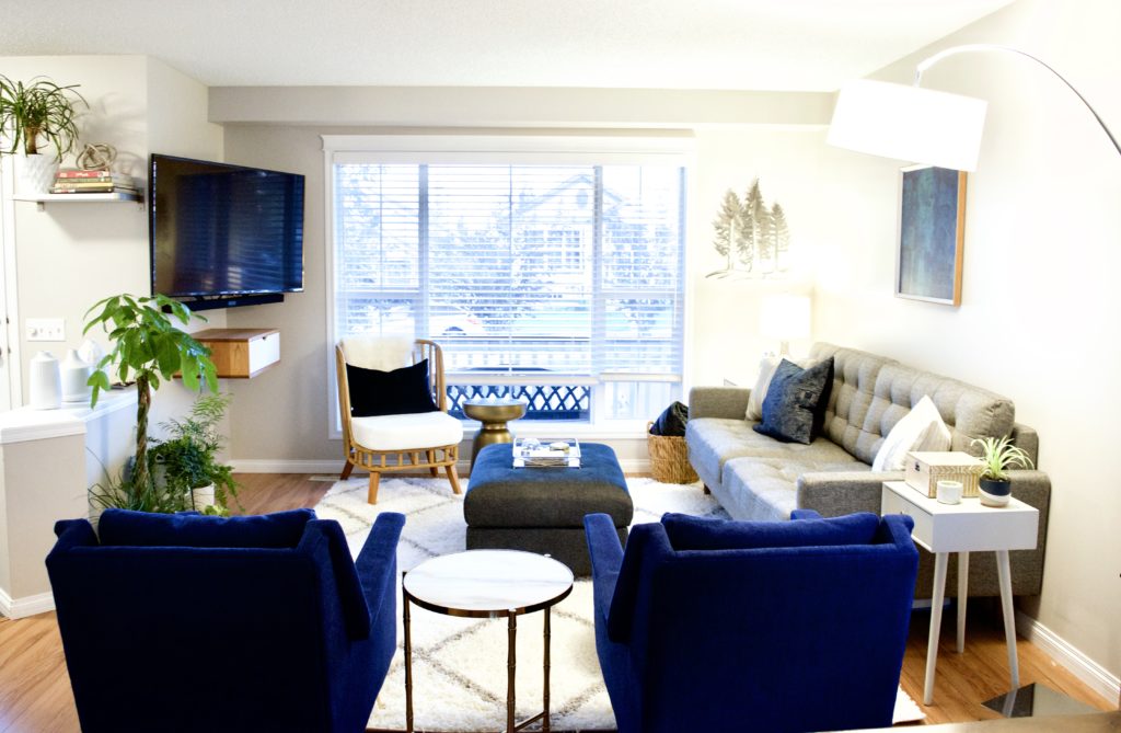
Our goal was to create a space that their toddler could play in comfortably but one that could also be easily transformed into a grown-up oasis when she went to bed. They wanted a mostly neutral space where their prized art would pop, but they also love colour and didn’t want it to be boring. I suggested adding some blue elements and they were immediately intrigued. Blue is such an easy colour to work with and goes with so much, if they ever decide to change their colour palette in the future, they won’t have a problem working the blue pieces in. This flexibility is especially important for them, as they like to move their art around quite frequently.
We began by discussing layout and choosing the larger pieces, starting with the blue Carlo chairs from West Elm, which immediately (and repeatedly!) caught their eyes. We also selected a cozy grey sofa, the rug and the large arc lamp. I suggested a storage ottoman to hold their daughter’s toys, and once we had these larger items ordered, they left the rest to me.
They had recently hung their TV and the floating media stand/drawer, so we decided to leave it as-is. The space underneath the TV gives them some extra flexibility for moving the ottoman out of the way while their daughter plays on the floor, and a place to stack the poufs out of the way, as needed.
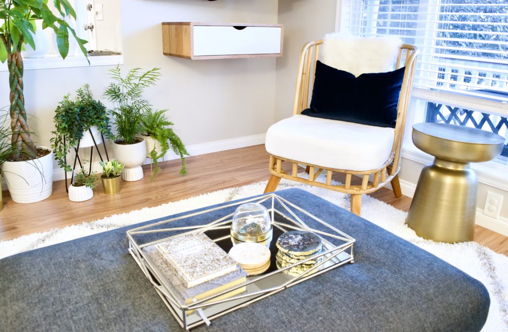
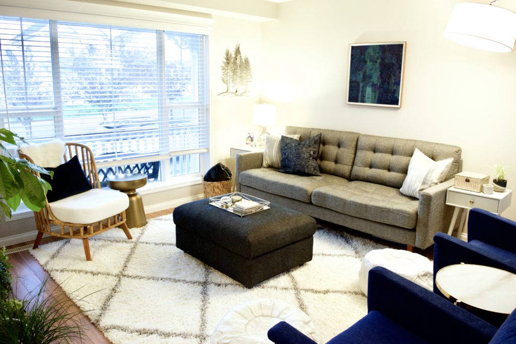
I was hoping to find an interesting antique chair to put in front of the window, but wasn’t having any luck finding one that would work well with everything else. I was so excited to find this awesome little wicker chair that creates a little playfulness and textural interest. Wicker in a dry climate like we have in Calgary can be a bit tricky, as it tends to crack. After a little research, I learned that spritzing it with water every few weeks should take care of any issues related to dryness and happily purchased it.
Due to space and a preference for a more minimal look, we chose to mix metal finishes, to bring in various textures, and add lots plants to create interest without adding too much stuff. The wicker chair and basket, shag rug, velvet chairs and cushion, sheepskin on the chair, white leather poufs and marble table top create a rich, layered feeling. A mix between shiny and matte silvers and golds add to the layered effect, elevating the space further.
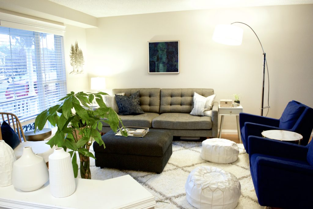
Choosing the plants was a bit of a trick, as they have a cat! After visiting nearly all of the garden centres in town, I came away with a good selection, including a Money Tree, Lipstick Plant, Boston Fern, Ponytail Palm, Parlour Palm, Peperomia, a cute little Air Plant, a variety of succulents, and several others.
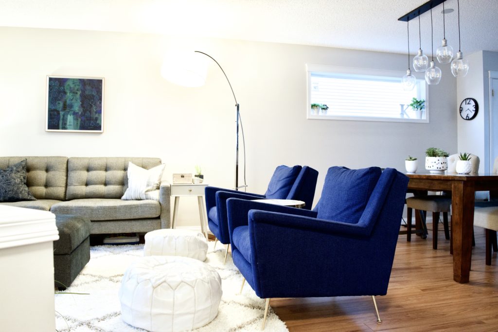
This reveal day was one of my all-time faves. While they knew what all the larger pieces of furniture would look like, there were quite a few unknowns, and they had their very own surprise makeover on the day of their anniversary. They were near-speechless for several minutes, and kept saying they couldn’t believe it was their home as their sweet little toddler explored all the new, interesting things. What a fun, special moment! I am so honoured that they were able to lean into the process and trust me to create a beautiful space just for them.
