French Country Family Room
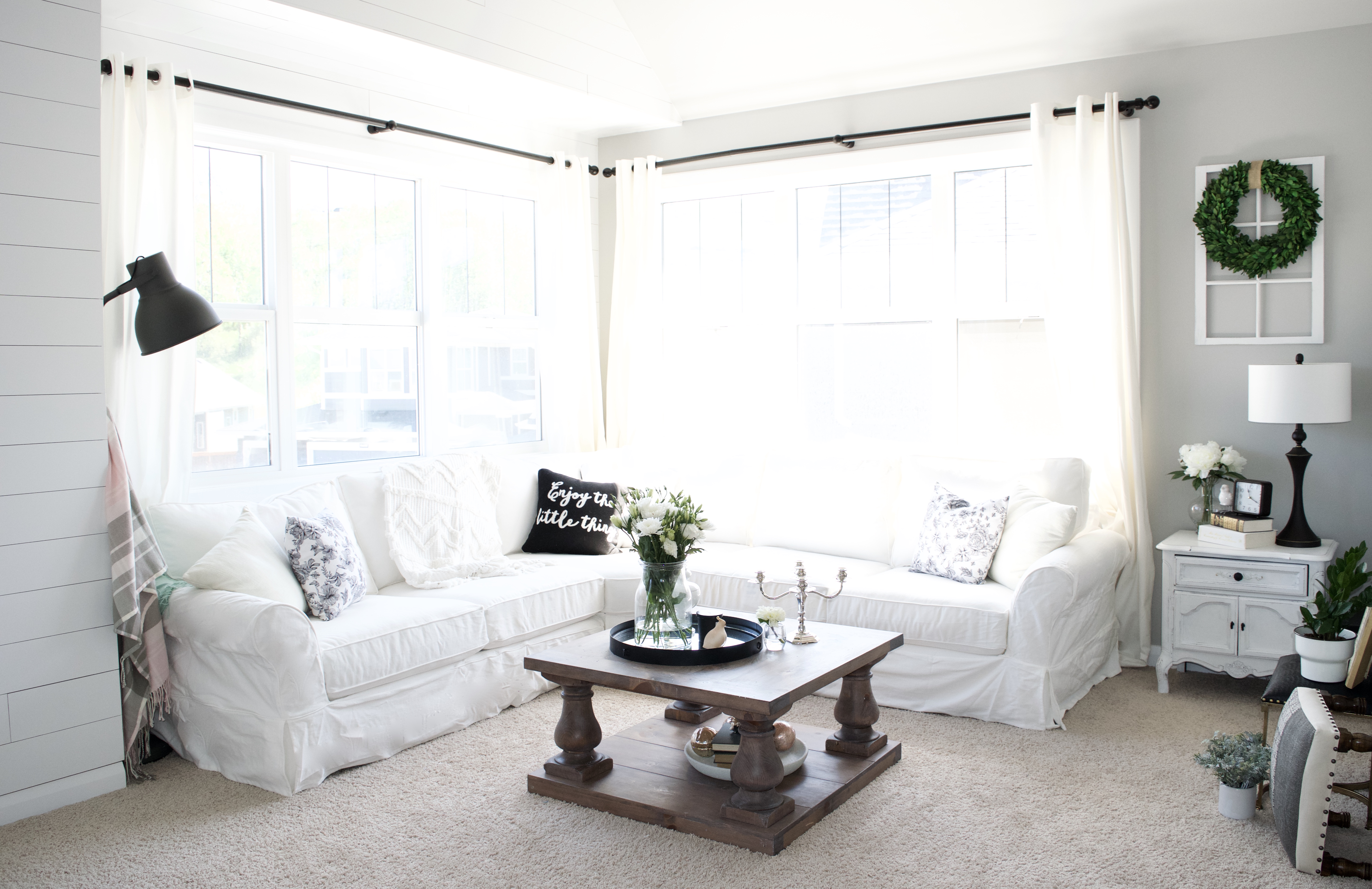
I recently had the immense pleasure of working with a sweet family on their bonus/family room. This room had yet to be decorated at all, though, the rest of their home is absolutely stunning. During the intake process, she described her style as French Country and had a beautiful, cohesive main floor with lots of feminine touches. As we spoke more, I understood why she was feeling a bit unsure about how to proceed. Her goal in redecorating the space, was to create a cozy family room that her husband would be eager to relax in. I could see she was leaning towards more masculine elements, and she clearly had his preferences in mind. She seemed to be feeling unsure about how well it would blend with the rest of the house, and reached out for help to make sure it was perfect. She had already picked out the lamp, the DIY pipe shelving, the couch, the large tv and a few other things, and needed help pulling it all together.
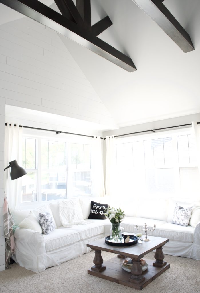
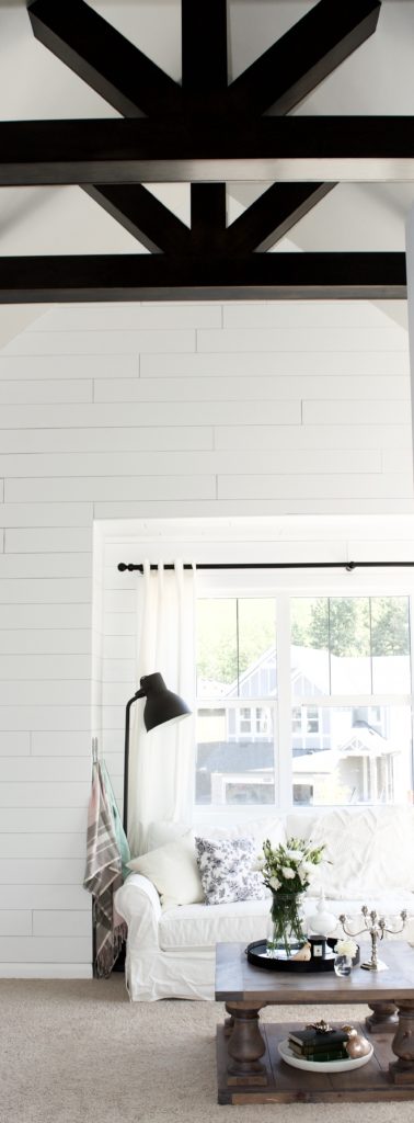
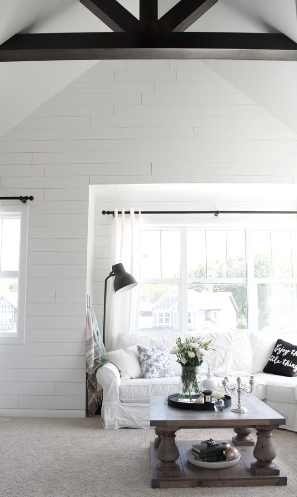
She mentioned that she had been considering a shiplap wall behind the tv, and I immediately began to encourage her to adjust the plan. The gorgeous, vaulted ceiling was already the focal point of the room as you enter through the hall, and I knew it was the perfect place for a planked wall. The only problem was that it was over the original budget. After some discussion and a quote, they agreed that it was the right choice for the space and worth increasing the budget. I’m so glad they decided to go for it! It took the project from pretty to WOW. Thank you to my favourite contractor, Wally, at Urban Village Contracting for the amazing work.
One of the biggest challenges of this project were the two large walls opposite the windows. At about 6′ wide, each, we needed enormous art. We briefly considered a gallery wall, but agreed that it would look busy, and would be a missed opportunity for some refreshing symmetry. Because we had already increased the budget for the wall, I wanted to be as thrifty as possible. As you can imagine, 2 coordinating pieces of XL wall art in the correct style is hard to find- never mind while I was determined to pinch pennies! When I suggested maps, the client mentioned that England and Ireland are meaningful places to their family and I knew we had an idea that I could run with. After searching far and wide, she and I found the shop YCK Collection on Etsy, at almost the same moment!
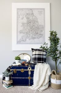
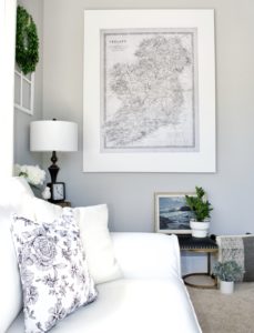
Unfortunately, that wasn’t the end of the ordeal! We needed a way to frame or mount the maps. I bought the map files, ordered engineering prints, and we landed on Mod Podging the maps onto plywood. It was a complete disaster. I’m not sure if Mod Podge changed their formula, or what was going on, but I’ve never had such a hard time working with it before! The maps wrinkled and bubbled despite me using every trick in the book. So, we regrouped and reprinted the maps. The client decided she would look for some frames, but anything even close to the right style in the size we needed, was thousands of dollars. In a stroke of genius, she picked up some canvases, and Mod Podged the maps onto them. This time, there was no bubbling and far less wrinkling. The bit of wrinkling that did happen, looked great and even aged them beautifully. Even with the cost of the failed first attempt, both pieces together were less than $250, which is quite impressive for 4 foot x 5 foot art!
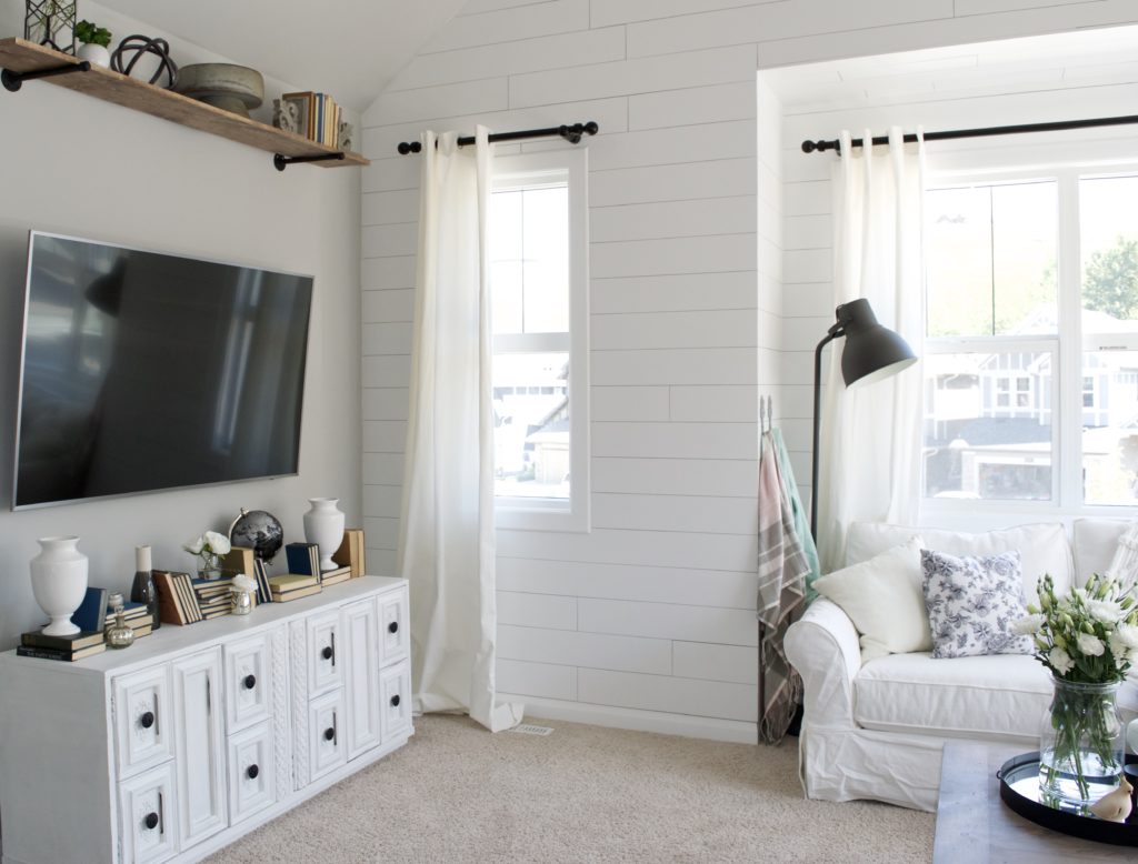
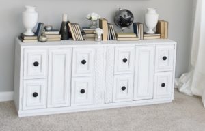
She is quite an avid DIYer, and has a business refinishing furniture and hosting sign-making events (check her work out HERE!) so she picked out and refinished the end table and media console herself. Gorgeous, right? She ordered the coffee table from a talented local maker, Out Of The Woodwork and distressed and finished it herself. She had also planned the rustic/industrial pipe shelving and installed it herself.
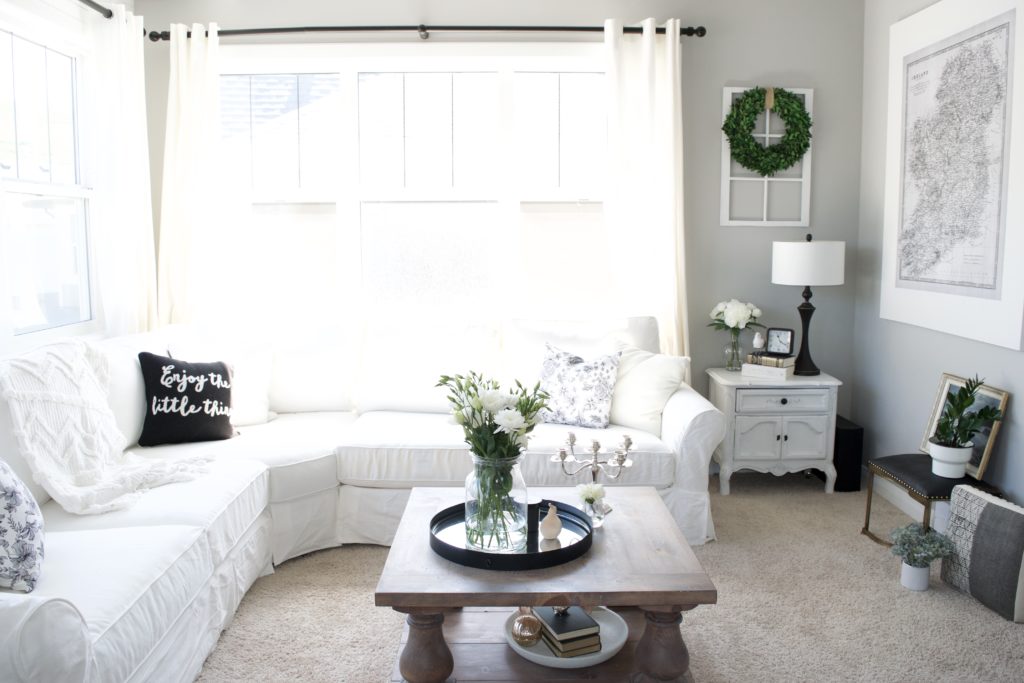
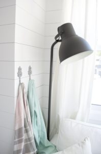
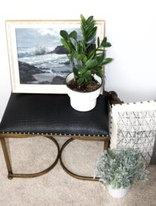
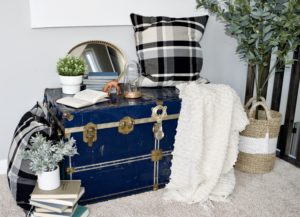
Much of my focus while choosing accents for the space was creating contrast to pull in the IKEA lamp they had picked out, and adding some soft layers and feminine accents to help blend the room with the rest of the house. The black wooden curtain rods add a pop to the planked wall and coordinate with the dark beams above. Other black accents such as the little bench, the table lamp and the black hardware on the media stand all work together for the same purpose. The silver candelabra, curvy white urns, flowers, blanket hooks and floral pillows take the edge off the more industrial and high contrast elements.
In the end, they were absolutely delighted with the bright, cozy space we created. It complements the rest of their home beautifully, and turned a formerly plain and ordinary room into a place they love to relax as a family. Perfection!
Want to find out more about how to make your house feel like this? Pop over to the Services page!
