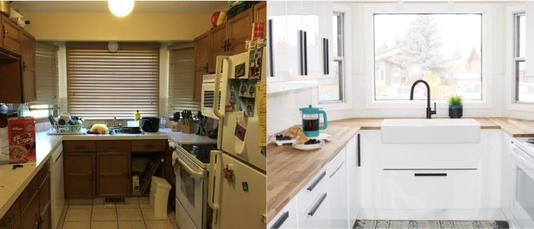
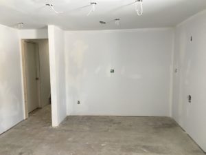
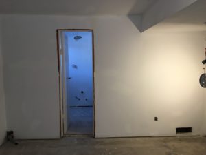
Over the past year I’ve had the pleasure of helping a former client plan renovations to their basement suite rental. The suite is a small semi open concept one bedroom/studio. It hadn’t been updated since well before the clients had moved into the house many years prior, as they had a great long-term renter when they purchased the home. The goal was for it to be classic, crowd-pleasing, and budget-aware while ensuring the quality of the finishes would hold up to years of rentals.


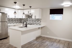
The clients had already, wisely determined they would use vinyl flooring because they knew it would wear well. I helped them pick an option that had various grey and brown tones in it, ensuring that it wouldn’t mark up or look dirty easily and would appeal to a range of renters. We selected Benjamin Moore’s Revere Pewter as the paint colour because it’s warm, neutral and looks good with nearly any colour. It’s really the perfect soft, warm gray!

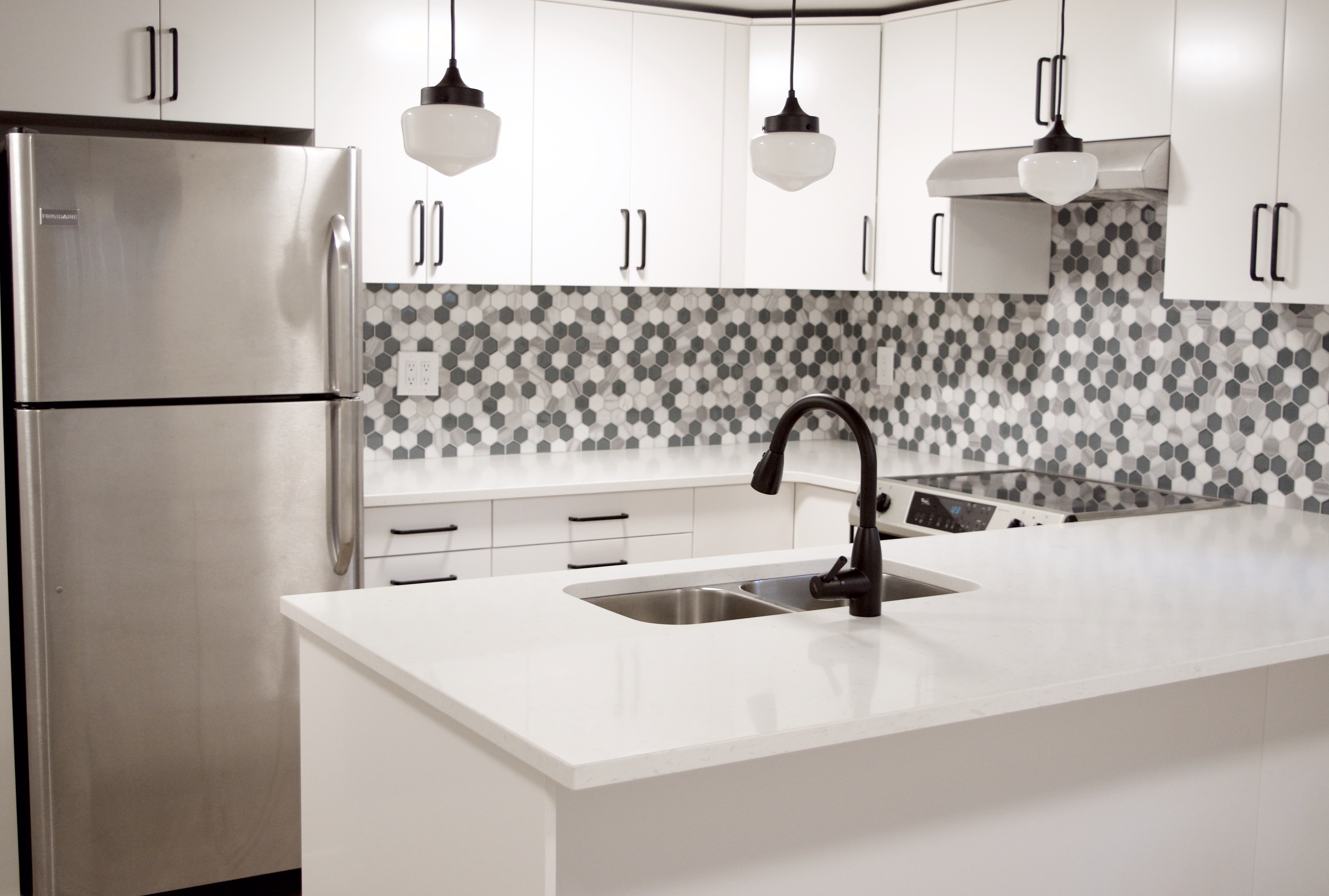
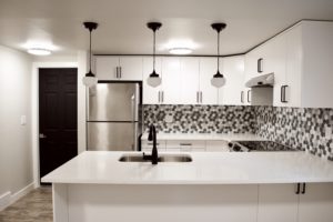
IKEA cabinets were the obvious budget friendly choice, and it’s so easy to upgrade the look of IKEA cabinets with non-laminate countertops. After some discussion, we settled on quartz countertops. Quartz is non-porous, so it resists staining better than other options, such as granite, marble, laminate or concrete, and is easier to clean. It also resists chipping and cracking better than granite or other stone surfaces which makes it appealing for a rental. The under mounted sink will be super easy to maintain/keep clean, which is ideal for a rental, and it looks polished on the large peninsula. The clients opted to add an overhang to create an eating bar, since the living space is quite minimal. On the back side of the peninsula, we were able to add some extra storage, as well. No wasted space, here!

Since the suite is in the basement, I suggested classic white on white cabinets and countertops. It brightens things up, and makes the space feel open and timeless, which is great for a small rental. The glass hex tile adds interest and a little colour to the backsplash, and black fixtures (like the gorgeous kitchen faucet) and finishes create contrast which keeps the white on white from being boring.

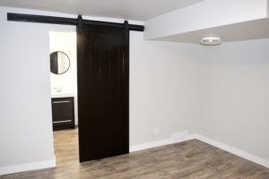
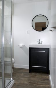
In the bathroom, the focus was function. Switching the standard door for a sliding barn door created more flexibility in the space, while giving the suite an updated, cool vibe. Painting the door black added to the contrast and made the bedroom/bathroom area really come alive. It’s the only focal point for a potential renter coming to look at the empty property, so it adds a lot of value and impact! The vanity was a thrifty, hardware store pick, and the round mirror creates interest with it’s contrasting lines.

I’m delighted to say that they had a lot of interest, and the suite was rented shortly after it was finished, above their initially projected rent, since there was nothing that compared on the market! They had a lot of positive feedback about their renovation results, and I’m confident it will be as easy to rent in the future, as well.
